Two Sevens Clash, Badly
 I was fascinated with 1970s baseball cards when I was a kid. Growing up in the 1980s, the 70s seemed like such an insanely colorful time in the game, with retina-burning color combinations, acres of polyester, and afros as far as the eye could see. On trips to Cooperstown, my favorite exhibit at the Hall of Fame was a collection of heinously ugly uniforms from the era (sadly, no longer there). Like Milhouse Van Houten, I coveted cards where players sported huge sideburns (though he preferred Carl Yasztremski, whereas I was partial to Willie McCovey's razor-sharp facial hair).
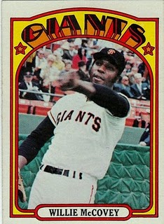
Topps (the only game in town for baseball cards in those days) mimicked the garishness of Me Decade baseball with its own colorful layouts. The 1975 set, for example, employed a different two-tone scheme for each team--even if said scheme didn't remotely match their uniform colors, as you can see in this George Brett card. And in 1972, the cards rendered team names in a bizarre, pseudo-art-deco style (as shown by the Stretch McCovey example to your right).
But my personal favorites remain the cards Topps put out in 1977, a relatively simple design with a few hidden treasures. I bought a big pile of them at one of the first baseball card shows I ever went to for the princely sum of $5. I'm sure these cards aren't worth half of that nowadays, but they've still provided me with hours of enjoyment.
That's because 1977 marked the apex of a now-lost baseball card craft: the hastily altered player photo. Few things made me happier as a lad than spotting an altered card, as if I'd caught Topps trying to pull a fast one on me (I was kind of a weird kid, if that wasn't obvious by now).
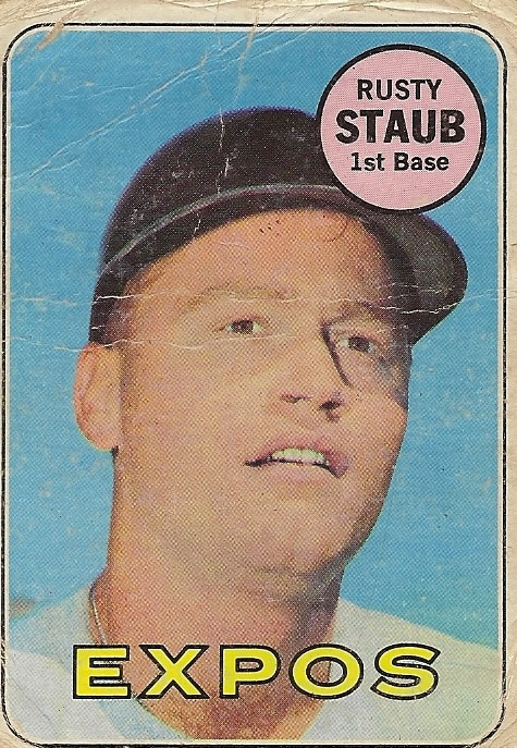
In the 1960s, when a player was traded in the offseason, Topps would simply black out his helmet and call it a day (as you can see here in this 1969 card for Rusty Staub, who was traded from Houston to Montreal that January). Beginning in the early 1970s, however, Topps decided to try for more realism. If a player was traded, they would take an old photo of them and paint in a new hat and uniform top to the best of their abilities--which varied highly.
 The artistry could be quite good, as in this card for St. Louis's Mike Caldwell, who has a well-rendered hat and uniform collar for his new team. But it could also be quite bad, as in this card for the A's Tommy Helms, which looks like it was done in a rush after a three-martini lunch.
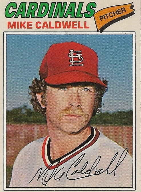
Why was 1977 the pinnacle of this craft? Because that year marked the debut of two expansion squads: the Mariners and the Blue Jays. Topps artistes had to scramble to paint new hats for brand new teams that hadn't yet played a game.
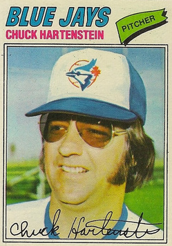
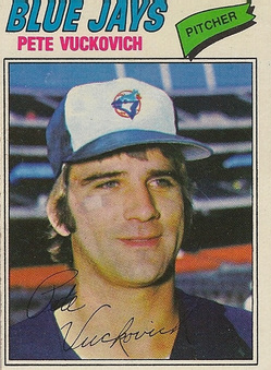
The task should have been especially challenging because of Toronto's squiggly, three-color, intricate logo. But for the most part, Topps did a decent job with the Blue Jays. This card for pitcher Chuck Hartentstein is an admirable piece of work, even if the Blue Jays' head feathers (for lack of a better word) are a bit long. It also shows that the Topps artists were not distracted by Chuck's slammin' aviators. Future Cy Young Award winner Pete Vuckovich's hat, on the other hand, received an accurate but strangely undersized logo.
For some reason, the Topps artistes struggled much more when trying to capture the relatively simple Mariners logo. You'd think a stable of craftsmen who could handle the Blue Jays' hat could easily handle a yellow trident on a plain blue field, but you'd be wrong.
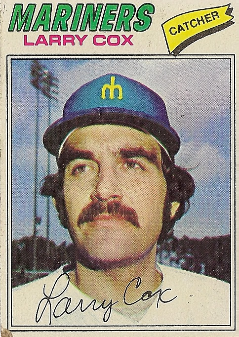
 The suave-looking Pete Broberg got a hat with an emaciated M, while teammate Dave Pagan's logo looks severely overfed, and his hat is a several shades lighter. But at least their logos received some cross-hatching to make them sort of look like they were stitched. Catcher Larry Cox did not get such respect, as his tiny M is simply placed on his hat, looking almost like a sticker.
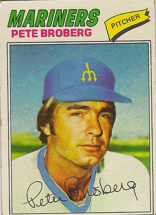
As a kid, I wondered what baseball cards would look like for the next expansion, and if the paint jobs be just as obvious. But by the time MLB expanded again in 1993, computerized photoshoppery had arrived, and I was preoccupied with other things. (Not anything less nerdy, mind you, just different forms of nerdery.) But I still bust out my baseball card album and pore over the masterpieces of these Picassos of cardboard.
Comments
